Custom Logo Embroidery That Looks Professional
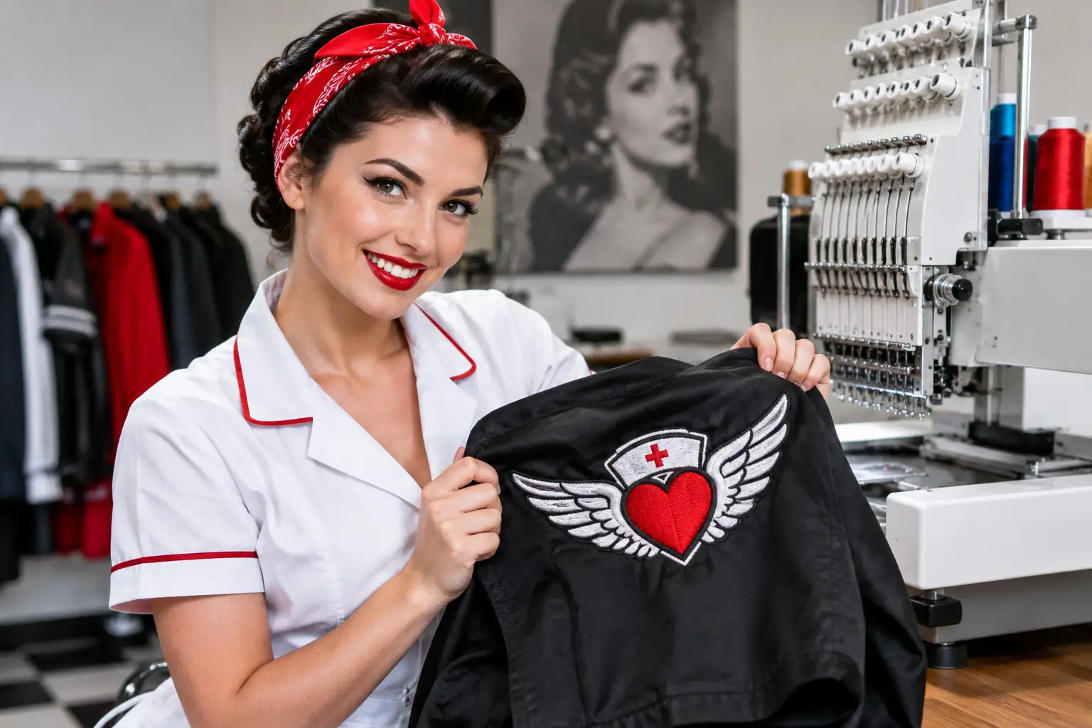
Custom logo embroidery gives teams a polished, durable uniform. Choose garments, placements, thread colors, and quantities look professional for years.
A logo on a work shirt is not decoration. For a patient checking in, a client meeting a field technician, or a parent arriving at a school office, it is an immediate signal of who belongs on the team and what standard they can expect. Custom logo embroidery gives that signal weight. The finish is textured, permanent, and composed in a way a temporary print rarely matches.
For medical practices, barns, trades, schools, hospitality teams, and professional offices, the best embroidered apparel does two jobs at once: it holds up through the workday and presents a unified identity without looking like promotional merchandise. Getting there comes down to a few decisions made before the first stitch is placed.
Start With the Job, Not the Logo
The garment should earn its place in the uniform. A polished polo may be right for a dental front office, while a soft-shell vest makes more sense for an equestrian barn, property-management team, or staff moving between indoor and outdoor work. Clinic jackets and quarter-zips offer a professional extra layer for medical, therapy, pharmacy, and lab teams. For trades, durability, mobility, and washability may matter more than a refined hand feel.
Custom logo embroidery performs best when the garment and the work environment agree. Consider where the piece will be worn, how often it will be washed, whether employees need pockets or layering room, and how formal the client-facing setting is. A lightweight performance polo can handle active days, but a heavier knit or structured jacket often carries a larger logo with more authority.
Color deserves the same attention. Navy, black, charcoal, and deep green are practical choices for busy roles because they hide everyday wear and let thread colors read cleanly. White and light gray can look crisp in clinical settings but require more care. The right answer depends on the team, not a blanket rule. A veterinary clinic may want approachable colors, while a law office or specialty practice may prefer a quieter palette that lets the logo do the talking.
Choose a Logo Placement People Recognize
The left chest remains the professional standard for a reason. It is visible during conversation, works across polos, jackets, vests, and button-downs, and keeps the logo close enough to read without taking over the garment. It is often the strongest choice for a company mark, practice name, department, or small emblem.
That does not mean every detail belongs on the left chest. A complex horizontal logo with a long tagline may need to be simplified, stacked, or moved to a larger placement. A full back design can work well for event staff, EMS units, service teams, and outerwear, particularly when identification needs to be visible from a distance. Sleeves are useful for flags, unit names, certifications, or a secondary mark, but space is limited and fine type can disappear quickly.
Size Follows the Garment and the Design
A small logo can look sharp on a polo and undersized on a heavyweight jacket. The same artwork may need a different stitch size for youth garments, extended sizes, women's cuts, or a fleece vest. Placement should also account for pockets, zippers, seams, and collar shape. These practical details separate a finished uniform from a logo that feels dropped onto a garment at random.
When names and credentials are part of the order, restraint matters. A first name, professional designation, or department line can make a uniform feel personal and useful. Too many lines of text, however, create a crowded result. Keep the hierarchy clear: organization first, individual identification second.
Prepare Artwork for Thread, Not a Screen
Embroidery is built from thread, so it has different rules than print. Tiny lettering, hairline strokes, subtle gradients, and dense photographic details do not always translate cleanly into stitches. Strong embroidered logos typically use clear shapes, sufficient spacing, and legible type.
This is where digitizing matters. Digitizing is the process of translating artwork into stitch instructions for the embroidery machine. It determines stitch direction, density, underlay, sequence, and how the design behaves on a specific fabric. Good digitizing helps a logo keep its shape; poor digitizing can produce puckering, gaps, loose edges, or lettering that looks heavier than intended.
A clean vector file is helpful, but it is not the only factor. A high-resolution logo, correct brand colors, and a clear understanding of the intended garment all support a better result. If the original logo has details that are too fine for a chest placement, simplify it rather than forcing it. A readable embroidered mark is more professional than a perfectly literal version no one can make out from three feet away.
Select Thread Colors With Real-World Contrast
Thread charts can be precise, but garments are seen under office lights, daylight, treatment-room lighting, and the occasional parking-lot sun. Contrast is what keeps a logo legible in all of them. Light thread on a dark garment and dark thread on a light garment are reliable starting points, though brand colors may call for a more considered combination.
Tone-on-tone embroidery can look premium on jackets and corporate apparel, especially when the goal is understated branding. The trade-off is visibility. A black-on-black logo may look excellent up close but disappear across a reception desk. This can be exactly right for executive outerwear and exactly wrong for a mobile service crew that needs to be identified immediately.
For multi-color logos, use the colors that carry recognition. Not every color in the original artwork must be stitched if reducing the palette improves clarity and keeps the design clean. Metallic, neon, and specialty threads can create an effect, but they should support the brand rather than compete with it.
Build an Order That Works Across the Team
A cohesive uniform program does not require everyone to wear the exact same item. In fact, it often works better when employees have a small, approved range. A practice may choose polos for front-office staff, jackets for clinical personnel, and vests for team members who need a lighter layer. The shared logo placement, garment color family, and thread treatment create the consistency.
Sizing is part of that professionalism. Ask for a complete size run early, including extended sizes and preferred cuts where available. Ordering a few extra core sizes can be useful for new hires, replacement needs, and sudden staffing changes. It may cost more upfront, but it avoids a mismatched re-order when the team needs another piece quickly.
For organizations placing a larger order, confirm the exact garment style, color, logo placement, thread colors, and personalization before production begins. The most expensive uniform mistake is rarely the logo itself. It is discovering that the jacket selected for the group has a chest pocket where the logo was intended to go, or that a name list was submitted with inconsistent credentials.
Know When Embroidery Is the Better Choice
Embroidery is especially suited to polos, jackets, vests, work shirts, hats, fleece, and durable uniforms. It provides dimension and a finish that stands up to regular wear. It is an investment in appearance, which makes it a natural fit for client-facing teams and garments intended to stay in rotation.
It is not automatically the best method for every design or every garment. Large, highly detailed full-back art may be better served by printing, depending on the fabric and use case. Thin performance fabrics can require careful stabilizing, while very small text may need adjustment regardless of the decoration method. The right recommendation starts with how the garment will be used, not with a one-size-fits-all answer.
At Corazón De Oro Apparel, custom work is approached as professional equipment with a personal finish. A properly embroidered logo tells patients, clients, students, and customers that the people in front of them are prepared, accountable, and proud of the work.
Before approving an order, take one final look at the garment, logo scale, thread contrast, and name list as a complete system. The goal is simple: apparel your team reaches for because it works hard, fits the role, and looks like it belongs to them.